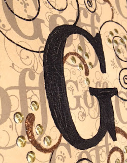
 On Kraft colored cardstock, I printed out the whole name in different sizes all over the page in a light gray. Then right smack in the center I placed the letter G, big & bold. Although you can read the last name in the background, the letter G is what is most eye catching!
On the centered G, a thick layer of crackle paint was generously spread. Let dry throughly on it's own to give the crackling ingredient time to do it's job. Here (dried) you can see the actual crackling effect! Very detailed!
 The thicker swirls in the Woodwynds font gave me the perfect opportunity to use distressed glitter glue. I know, distressed glitter just goes against all grains! This worked nicely against the Kraft colored cardstock. It was thicker but not overpowering. When dried, I added some foam metal dots where the Woodwynds font dots were. Striking! I just love adding metal in my artwork! Gives it the POP I was looking for.
Another view of the G. I didn't want the black swirls to overpower the piece so I used a black diamond glitter glue to all the thin lines coming off the main G. This adds a wonderful sparkle to the piece. Now, cut the piece down to a 8x10 and it's now ready for framing!

No matter how I angled this frame, I kept getting reflections off the wood or glass. But it does show the whole end effect. When it gets hung on the wall, perhaps that will give me a better picture.
If you've not tried Duetica Lettering Arts Studio, you should! It's an awesome new twist in lettering!
Supplies Used
Duetica Lettering Arts Studio
Microsoft Publisher
Stickles: Black Diamond
Ranger: Distressed Vintage Paper
Microsoft Publisher
Stickles: Black Diamond
Ranger: Distressed Vintage Paper
Gold Metal Dots with foam adhesive
Ranger: Black Crackle Paint
No comments:
Post a Comment